Plotly Beta: Collaborative Plotting with R

(Guest post by Matt Sundquist on a lovely new service which is pro-actively supporting an API for R)

The Plotly R graphing library  allows you to create and share interactive, publication-quality plots in your browser. Plotly is also built for working together, and makes it easy to post graphs and data publicly with a URL or privately to collaborators.

In this post, we’ll demo Plotly, make three graphs, and explain sharing. As we’re quite new and still in our beta, your help, feedback, and suggestions go a long way and are appreciated. We’re especially grateful for Tal’s help and the chance to post.

Installing Plotly

Sign-up and Install (more in documentation)

From within the R console:

install.packages("devtools")
library("devtools")

Next, install plotly (a big thanks to Hadley, who suggested the GitHub route):

devtools::install_github("plotly/R-api")
# ...
# * DONE (plotly)

Then sign-up like this or at https://plot.ly/:

>library(plotly)
>response = signup (username = 'username', email= 'youremail')
…
Thanks for signing up to plotly!

Your username is: MattSundquist

Your temporary password is: pw. You use this to log into your plotly account at https://plot.ly/plot. Your API key is: “API_Key”. You use this to access your plotly account through the API.

To get started, initialize a plotly object with your username and api_key, e.g.
>>> p <- plotly(username="MattSundquist", key="API_Key")
Then, make a graph!
>>> res <- p$plotly(c(1,2,3), c(4,2,1))

And we’re up and running! You can change and access your password and key in your homepage.

1. Overlaid Histograms:

Here is our first script.

library("plotly")
p <- plotly(username="USERNAME", key="API_Key")

x0 = rnorm(500)
x1 = rnorm(500)+1
data0 = list(x=x0,
             type='histogramx',
opacity=0.8)
data1 = list(x=x1,
             type='histogramx',
opacity=0.8)
layout = list(barmode='overlay')

response = p$plotly(data0, data1, kwargs=list(layout=layout))

browseURL(response$url)

The script makes a graph. Use the RStudio viewer or add “browseURL(response$url)” to your script to avoid copy and paste routines of your URL and open the graph directly.

image001

Continue reading "Plotly Beta: Collaborative Plotting with R"

R-bloggers: an example of how interest networks propel viral events

A guest post by Jeff Hemsley, who has co-authored with Karine Nahon a new book titled Going Viral.
————————-

In Going Viral (Polity Press, 2013) we explore the topic of virality, the process of sharing messages that results in a fast, broad spread of information. What does that have to do R, or the R-bloggers community? First and foremost, we use the R-bloggers community as an example of the role of interest networks (see description below) in driving viral events. But we also used R as our go-to tool for our research that went into the book. Even the cover art, pictured here, was created with R, using the iGraph package. Included below is an excerpt from chapter 4 that includes the section on interest networks and R-bloggers.

GoingViral

Continue reading “R-bloggers: an example of how interest networks propel viral events”

R 3.0.2 and RStudio 0.9.8 are released!

R 3.0.2 (codename “Frisbee Sailing”) was released yesterday. The full list of new features and bug fixes is provided below.

Also, RStudio v0.98 (in a “secret” preview) was announced two days ago with MANY new features, including:

Upgrading to R 3.0.2

You can download the latest version from here. Or, if you are using Windows, you can upgrade to the latest version using the installr package (also available on CRAN and github). Simply run the following code:

# installing/loading the package:
if(!require(installr)) {
install.packages("installr"); require(installr)} #load / install+load installr

updateR(to_checkMD5sums = FALSE) # the use of to_checkMD5sums is because of a slight bug in the MD5 file on R 3.0.2. This issue is already resolved in the installr version on github, and will be released into CRAN in about a month from now..

I try to keep the installr package updated and useful. If you have any suggestions or remarks on the package, you’re invited to leave a comment below.

If you use the global library system (as I do), you can run the following in the new version of R:

source("https://www.r-statistics.com/wp-content/uploads/2010/04/upgrading-R-on-windows.r.txt")
New.R.RunMe()

p.s: you can also use the installr package to quickly install the new RStudio by using:

# installing/loading the package:
if(!require(installr)) {
install.packages("installr"); require(installr)} #load / install+load installr

install.RStudio()

Continue reading “R 3.0.2 and RStudio 0.9.8 are released!”

A speed test comparison of plyr, data.table, and dplyr

ssssssspeed_521872450_d085d1e928

Guest post by Jake Russ

For a recent project I needed to make a simple sum calculation on a rather large data frame (0.8 GB, 4+ million rows, and ~80,000 groups). As an avid user of Hadley Wickham’s packages, my first thought was to use plyr. However, the job took plyr roughly 13 hours to complete.

plyr is extremely efficient and user friendly for most problems, so it was clear to me that I was using it for something it wasn’t meant to do, but I didn’t know of any alternative screwdrivers to use.

I asked for some help on the manipulator Google group , and their feedback led me to data.table and dplyr, a new, and still in progress, package project by Hadley.

What follows is a speed comparison of these three packages incorporating all the feedback from the manipulator folks. They found it informative, so Tal asked me to write it up as a reproducible example.

Continue reading “A speed test comparison of plyr, data.table, and dplyr”

K-means Clustering (from "R in Action")

In R’s partitioning approach, observations are divided into K groups and reshuffled to form the most cohesive clusters possible according to a given criterion. There are two methods—K-means and partitioning around mediods (PAM). In this article, based on chapter 16 of R in Action, Second Edition, author Rob Kabacoff discusses K-means clustering.

In R’s partitioning approach, observations are divided into K groups and reshuffled to form the most cohesive clusters possible according to a given criterion. There are two methods—K-means and partitioning around mediods (PAM). In this article, based on chapter 16 of R in Action, Second Edition, author Rob Kabacoff discusses K-means clustering.

Until Aug 21, 2013, you can buy the book: R in Action, Second Edition with a 44% discount, using the code: “mlria2bl”.

K-means clustering

The most common partitioning method is the K-means cluster analysis. Conceptually, the K-means algorithm:

  1. Selects K centroids (K rows chosen at random)
  2. Assigns each data point to its closest centroid
  3. Recalculates the centroids as the average of all data points in a cluster (i.e., the centroids are p-length mean vectors, where p is the number of variables)
  4. Assigns data points to their closest centroids
  5. Continues steps 3 and 4 until the observations are not reassigned or the maximum number of iterations (R uses 10 as a default) is reached.

Implementation details for this approach can vary.

R uses an efficient algorithm by Hartigan and Wong (1979) that partitions the observations into k groups such that the sum of squares of the observations to their assigned cluster centers is a minimum. This means that in steps 2 and 4, each observation is assigned to the cluster with the smallest value of:

equation_1_RinAction2CH16

Where k is the cluster,xij is the value of the jth variable for the ith observation, and xkj-bar is the mean of the jth variable for the kth cluster.

Continue reading “K-means Clustering (from "R in Action")”

Analyzing Your Data on the AWS Cloud (with R)

Guest post by Jonathan Rosenblatt

Disclaimer:
This post is not intended to be a comprehensive review, but more of a “getting started guide”. If I did not mention an important tool or package I apologize, and invite readers to contribute in the comments.

Introduction

I have recently had the delight to participate in a “Brain Hackathon” organized as part of the OHBM2013 conference. Being supported by Amazon, the hackathon participants were provided with Amazon credit in order to promote the analysis using Amazon’s Web Services (AWS). We badly needed this computing power, as we had 14*109 p-values to compute in order to localize genetic associations in the brain leading to Figure 1.

Figure 1- Brain volumes significantly associated to genotype.
brain_image01

While imaging genetics is an interesting research topic, and the hackathon was a great idea by itself, it is the AWS I wish to present in this post. Starting with the conclusion: 

Storing your data and analyzing it on the cloud, be it AWSAzureRackspace or others, is a quantum leap in analysis capabilities. I fell in love with my new cloud powers and I strongly recommend all statisticians and data scientists get friendly with these services. I will also note that if statisticians do not embrace these new-found powers, we should not be surprised if data analysis becomes synonymous with Machine Learning and not with Statistics (if you have no idea what I am talking about, read this excellent post by Larry Wasserman).

As motivation for analysis in the cloud consider:

  1. The ability to do your analysis from any device, be it a PC, tablet or even smartphone.
  2. The ability to instantaneously augment your CPU and memory to any imaginable configuration just by clicking a menu. Then scaling down to save costs once you are done.
  3. The ability to instantaneously switch between operating systems and system configurations.
  4. The ability to launch hundreds of machines creating your own cluster, parallelizing your massive job, and then shutting it down once done.

Here is a quick FAQ before going into the setup stages.

FAQ

Q: How does R fit in?

Continue reading “Analyzing Your Data on the AWS Cloud (with R)”

Tailor Your Tables with stargazer: New Features for LaTeX and Text Output

Guest post by Marek Hlavac

Since its first introduction on this blog, stargazer, a package for turning R statistical output into beautiful LaTeX and ASCII text tables, has made a great deal of progress. Compared to available alternatives (such as apsrtable or texreg), the latest version (4.0) of stargazer supports the broadest range of model objects. In particular, it can create side-by-side regression tables from statistical model objects created by packages AER, betareg, dynlm, eha, ergm, gee, gmm, lme4, MASS, mgcv, nlme, nnet, ordinal, plm, pscl, quantreg, relevent, rms, robustbase, spdep, stats, survey, survival and Zelig.  You can install stargazer from CRAN in the usual way:

install.packages(“stargazer”)

New Features: Text Output and Confidence Intervals

In this blog post, I would like to draw attention to two new features of stargazer that make the package even more useful:

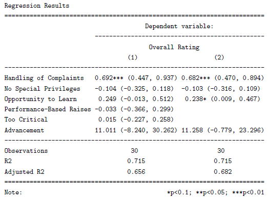
  • stargazer can now produce ASCII text output, in addition to LaTeX code. As a result, users can now create beautiful tables that can easily be inserted into Microsoft Word documents, published on websites, or sent via e-mail. Sharing your regression results has never been easier. Users can also use this feature to preview their LaTeX tables before they use the stargazer-generated code in their .tex documents.
  • In addition to standard errors, stargazer can now report confidence intervals at user-specified confidence levels (with a default of 95 percent). This possibility might be especially appealing to researchers in public health and biostatistics, as the reporting of confidence intervals is very common in these disciplines.

In the reproducible example presented below, I demonstrate these two new features in action.


Reproducible Example

I begin by creating model objects for two Ordinary Least Squares (OLS) models (using the lm() command) and a probit model (using glm() ). Note that I use data from attitude, one of the standard data frames that should be provided with your installation of R.

## 2 OLS models

linear.1 <- lm(rating ~ complaints + privileges + learning + raises + critical, data=attitude)
linear.2 <- lm(rating ~ complaints + privileges + learning, data=attitude)

## create an indicator dependent variable, and run a probit model

attitude$high.rating <- (attitude$rating > 70)
probit.model <- glm(high.rating ~ learning + critical + advance, data=attitude, family = binomial(link = "probit"))

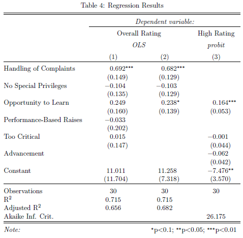
I then use stargazer to create a ‘traditional’ LaTeX table with standard errors. With the sole exception of the argument no.space – which I use to save space by removing all empty lines in the table – both the command call and the resulting table should look familiar from earlier versions of the package:

stargazer(linear.1, linear.2, probit.model, title="Regression Results", align=TRUE, dep.var.labels=c("Overall Rating","High Rating"), covariate.labels=c("Handling of Complaints","No Special Privileges", "Opportunity to Learn","Performance-Based Raises","Too Critical","Advancement"), omit.stat=c("LL","ser","f"), no.space=TRUE)

table_example_1

Continue reading "Tailor Your Tables with stargazer: New Features for LaTeX and Text Output"

Creating good looking survival curves – the 'ggsurv' function

This is a guest post by Edwin Thoen

Currently I am doing my master thesis on multi-state models. Survival analysis was my favourite course in the masters program, partly because of the great survival package which is maintained by Terry Therneau. The only thing I am not so keen on are the default plots created by this package, by using plot.survfit. Although the plots are very easy to produce, they are not that attractive (as are most R default plots) and legends has to be added manually. I come across them all the time in the literature and wondered whether there was a better way to display survival. Since I was getting the grips of ggplot2 recently I decided to write my own function, with the same functionality as plot.survfitbut with a result that is much better looking. I stuck to the defaults of plot.survfit as much as possible, for instance by default plotting confidence intervals for single-stratum survival curves, but not for multi-stratum curves. Below you’ll find the code of the ggsurv function. Just as plot.survfit it only requires a fitted survival object to produce a default plot. We’ll use the lung data set from the survival package for illustration. First we load in the function to the console (see at the end of this post).

Once the function is loaded, we can get going, we use the lung data set from the survival package for illustration.

library(survival)
data(lung)
lung.surv <- survfit(Surv(time,status) ~ 1, data = lung)
ggsurv(lung.surv)

unnamed-chunk-2

Continue reading "Creating good looking survival curves – the 'ggsurv' function"

Top 100 R packages for 2013 (Jan-May)!

What are the top 100 (most downloaded) R packages in 2013? Thanks to the recent release of RStudio of their “0-cloud” CRAN log files (but without including downloads from the primary CRAN mirror or any of the 88 other CRAN mirrors), we can now answer this question (at least for the months of Jan till May)!

By relying on the nice code that Felix Schonbrodt recently wrote for tracking packages downloads, I have updated my installr R package with functions that enables the user to easily download and visualize the popularity of R packages over time. In this post I will share some nice plots and quick insights that can be made from this great data. The code for this analysis is given at the end of this post.

Top 8 most downloaded R packages – downloads over time

Let’s first have a look at the number of downloads per day for these 5 months, of the top 8 most downloaded packages (click the image for a larger version):

top_8_R_Packages_over_time

We can see the strong weekly seasonality of the downloads,  with Saturday and Sunday having much fewer downloads than other days. This is not surprising since we know that the countries which uses R the most have these days as rest days (see James Cheshire’s world map of R users). It is also interesting to note how some packages had exceptional peaks on some dates. For example, I wonder what happened on January 23rd 2013 that the digest package suddenly got so many downloads, or that colorspace started getting more downloads from April 15th 2013.

“Family tree” of the top 100 most downloaded R packages

We can extract from this data the top 100 most downloaded R packages. Moreover, we can create a matrix showing for each package which of our unique ids (censored IP addresses), has downloaded which package. Using this indicator matrix, we can thing of the “similarity” (or distance) between each two packages, and based on that we can create a hierarchical clustering of the packages – showing which packages “goes along” with one another.

With this analysis, you can locate package on the list which you often use, and then see which other packages are “related” to that package.  If you don’t know that package – consider having a look at it – since other R users are clearly finding the two packages to be “of use”.

Such analysis can (and should!) be extended. For example, we can imagine creating a “suggest a package” feature based on this data, utilizing the package which you use, the OS that you use, and other parameters.  But such coding is beyond the scope of this post.

Here is the “family tree” (dendrogram) of related packages:

Family_tree_of_Top_100_R_Packages

To make it easier to navigate, here is a table with links to the top 100 R packages, and their links:

Continue reading “Top 100 R packages for 2013 (Jan-May)!”

Answering "How many people use my R package?"

The question “How many people use my R package?” is a natural question that (I imagine) every R package developer asks himself at some point or another. After many years in the dark, a silver lining has now emerged thanks to the good people at RStudio. Just yesterday, a blog post by Hadley Wickham was written about the newly released CRAN log files of the RStudio cloud CRAN!

Already out, and the R blogosphere started buzzing with action: James Cheshire created a beautiful world map which highlights the countries based on how much people there use of R. Felix Schonbrodt wrote a great post on Tracking CRAN packages downloads. In the meantime, I’ve started crafting some basic functions for package developers to easily check how many users downloaded their package. These functions are now available on the installr package github page.

Here is the output for the number of unique ips who downloaded the installr package around the time R 3.0.0 was released (click to see a larger image):

installr_installations_per_day

And here is the code to allow you to make a similar plot for the package which interests you:

# if (!require('devtools')) install.packages('devtools'); require('devtools')
# make sure you have Rtools installed first! if not, then run:
#install_Rtools()
#install_github('installr', 'talgalili') # get the latest installr R package
# or run the code from here:
# https://github.com/talgalili/installr/blob/master/R/RStudio_CRAN_data.r

if(packageVersion("installr") %in% c("0.8","0.9","0.9.2")) install.packages('installr') #If you have one of the older installr versions, install the latest one....

require(installr)

# The first two functions might take a good deal of time to run (depending on the date range)
RStudio_CRAN_data_folder <- download_RStudio_CRAN_data(START = '2013-04-02', END = '2013-04-05') # around the time R 3.0.0 was released
my_RStudio_CRAN_data <- read_RStudio_CRAN_data(RStudio_CRAN_data_folder)

 # barplots: (more functions can easily be added in the future)
barplot_package_users_per_day("plyr", my_RStudio_CRAN_data)
barplot_package_users_per_day("installr", my_RStudio_CRAN_data)

If you (the reader) are interested in helping me extend (/improve) these functions, please do so - I'd be happy to accept pull requests (or comments/e-mails).