“Chitika research” published today a fun small dataset (you can download it from here) in a post titled “The Educated are Harder to Advertise To”.
In this post I have three goals in mind:
- Suggesting another plot instead of the one used in the original post.
- Emphasizing the “Correlation does not imply causation” rule.
- Inviting other R lovers (as myself) to find fun things to do with this (and similar) dataset.
The Data
The data set is comprised of 51 rows, one for each US states with the two variables (columns):
- CTR – The CTR means “Click Through Rate” and is from chitika data base and collected from over two random days in January (a total of 31,667,158 total impressions), and is from the full range of Internet users (they don’t have traditional demographic data – every impression is completely anonymous).
- Percent of the population who graduated college.
Super basic analysis and plot
This data presents a stunning -0.63 correlation between the two measurements. Hinting that “The Educated are Harder to Advertise To” (as the original post suggested). The data can be easily visualized using a scatter plot:

Created using just a few lines of R code:
aa <- read.table("https://www.r-statistics.com/wp-content/uploads/2010/02/State_CTR_Date.txt", sep = "t", header = T)
aa[,2:3] <- aa[,2:3] * 100
plot(aa[,2] ~ aa[,3], sub = paste("Correlation: ", round(cor(aa[,2], aa[,3]), 2)),
	main = "Scatter plot of %CTR VS %College_Grad per State",
	xlab = "%College_Grad per State",
	ylab = "%CTR per State"
	)
abline(lm(aa[,2] ~ aa[,3]), col = "blue")
My conclusion from the analysis
I was asked in the comments (by Eyal) to add my own conclusions to the analysis. Does higher intelligence imply lower chances of clicking ads, my answer (under the present data) is simple "I don't know". The only real conclusion I can make of the data is that there might be a point in checking this effect in a more rigorous way (which I am sure is already being done).
What should we have done in order to know? When doing scientific research, we often ask ourselves how sure are we of our results. The rule of thumb for this type of question is called "the pyramid of evidence". It is a way to organize various ways of getting "information" about the world, in an hierarchy of reliability. Here is a picture of this pyramid:

(Credit: image source)
We can see that the most reliable source is a systematic review of randomized controlled trials. In our case, that would mean having controlled experiments where you take groups of people with different levels of "intelligence" (how would you measure that?), and check their CTR (click through rates) on banner ads. This should be done in various ways, correcting for various confounders , and later the results and conclusions (from several such experiments) should be systematically reviewed by experts on the subject.
All of this should be done in order to make a real assessment of the underlying question - how does smarts effects banner clicking.
And the reason we need all of this work is because of what is said in the title of the next section:
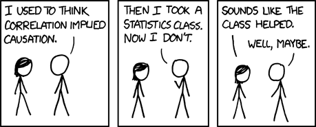
Correlation does not imply causation
As is written in the article on wikipedia:
"Correlation does not imply causation" is a phrase used in science and statistics to emphasize that correlation between two variables does not automatically imply that one causes the other (though it does not remove the fact that correlation can still be a hint, whether powerful or otherwise). The opposite belief, correlation proves causation, is a logical fallacy by which two events that occur together are claimed to have a cause-and-effect relationship.
But a much clearer explenation of it was given by the following XKCD comic strip:

Next step: other resources to play with
The motivation for my post is based on this digg post trying to hint how Religiousness is connected to "negative" things such as crimes, poverty and so on. That post was based on the following links:
- http://www.gallup.com/poll/114022/state-states-importance-religion.aspx#2
- http://www.top50states.com/average-iq-score.html
- http://www.census.gov/cgi-bin/saipe/national.cgi?year=2008&ascii=
- http://www.census.gov/compendia/statab/cats/law_enforcement_courts_prisons/crimes_and_crime_rates.html
- http://www.infoplease.com/ipa/a0923080.html
- http://www.fraserinstitute.org/researchandpublications/publications/7071.aspx
- http://www.gallup.com/poll/122333/political-ideologt-conservative-label-prevails-south.aspx#2
- http://www.ahiphiwire.org/wellbeing/display.aspx?doc_code=RWBStateRanks
If someone is motivated, he/she can extract that data and combine it with the current provided data.
In conclusion: this simplistic dataset, combined with other data resources, provides opportunity for various fun demonstrations of pairs correlation plots and of nice spatial plots (of states colored by their matching variable). It is a good opportunity to emphasize (to students, friends and the like) that "Correlation does not imply causation!".
And finally - If you are an R lover/blogger and feel like playing with this - please let me know 🙂 .


