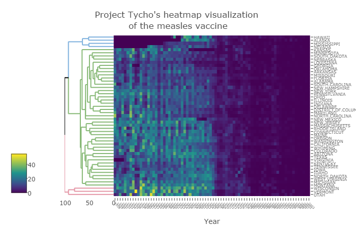
heatmaply: an R package for creating interactive cluster heatmaps for online publishing

This post on the heatmaply package is based on my recent paper from the journal bioinformatics (a link to a stable DOI). The paper was published just last week, and since it is released as CC-BY, I am permitted (and delighted) to republish it here in full. My co-authors for this paper are Jonathan Sidi, Alan O’Callaghan, and Carson Sievert.

Summary: heatmaply is an R package for easily creating interactive cluster heatmaps that can be shared online as a stand-alone HTML file. Interactivity includes a tooltip display of values when hovering over cells, as well as the ability to zoom in to specific sections of the figure from the data matrix, the side dendrograms, or annotated labels.  Thanks to the synergistic relationship between heatmaply and other R packages, the user is empowered by a refined control over the statistical and visual aspects of the heatmap layout.

Availability: The heatmaply package is available under the GPL-2 Open Source license. It comes with a detailed vignette, and is freely available from: http://cran.r-project.org/package=heatmaply

Continue reading “heatmaply: an R package for creating interactive cluster heatmaps for online publishing”

Data Driven Cheatsheets

Guest post by Jonathan Sidi

Cheatsheets are currently built and used exclusivley as a teaching tool. We want to try and change this and produce a cheat sheet that gives a roadmap to build a known product, but also is built as a function so users can input data into it to make the cheatsheet more personalized. This gives a versalility of a consistent format that people can share with each other, but has the added value of conveying a message through data driven visual changes.

Example

ggplot2 themes

The ggplot2 theme object is an amazing object you can specify nearly any part of the plot that is not conditonal on the data. What sets the theme object apart is that its structure is consistent, but the values in it change. In addition to change a theme it is a single function that too has a consistent call. The reoccuring challenge for users is to remember all the options that can be used in the theme call (there are approximately 220 unique options to calibrate at last count) or bookmark the help page for the theme and remember how you deciphered it last time.

This becomes a problem to pass all the information of the theme to someone who does not know what the values are set in your theme and attach instructions on it to let them recreate it without needing to open any web pages.

In writing the library ggedit we tried to make it easy to edit your theme so you don’t have to know too much about ggplots to make a large number of changes at once, for a quick clip see here. We had to make it easy to track those changes for people who are not versed in R, and plot.theme() was the outcome. In short think of the theme as a lot of small images that are combined to create a singel portrait.

Continue reading “Data Driven Cheatsheets”

ggedit 0.0.2: a GUI for advanced editing of ggplot2 objects

Guest post by Jonathan Sidi, Metrum Research Group

Last week the updated version of ggedit was presented in RStudio::conf2017. First, a BIG thank you to the whole RStudio team for a great conference and being so awesome to answer the insane amount of questions I had (sorry!). For a quick intro to the package see the previous post.

To install the package:

devtools::install_github("metrumresearchgroup/ggedit",subdir="ggedit")

Highlights of the updated version.

  • verbose script handling during updating in the gagdet (see video below)
  • verbose script output for updated layers and theme to parse and evaluate in console or editor
  • colourpicker control for both single colours/fills and and palletes
  • output for scale objects eg scale*grandient,scale*grandientn and scale*manual
  • verbose script output for scales eg scale*grandient,scale*grandientn and scale*manual to parse and evaluate in console or editor
  • input plot objects can have the data in the layer object and in the base object.
    • ggplot(data=iris,aes(x=Sepal.Width,y=Sepal.Length,colour=Species))+geom_point()
    • ggplot(data=iris,aes(x=Sepal.Width,y=Sepal.Length))+geom_point(aes(colour=Species))
    • ggplot()+geom_point(data=iris,aes(x=Sepal.Width,y=Sepal.Length,colour=Species))
  • plot.theme(): S3 method for class ‘theme’
    • visualizing theme objects in single output
    • visual comparison of two themes objects in single output
    • will be expanded upon in upcoming post

Continue reading “ggedit 0.0.2: a GUI for advanced editing of ggplot2 objects”

ggedit – interactive ggplot aesthetic and theme editor

Guest post by Jonathan Sidi, Metrum Research Group

ggplot2 has become the standard of plotting in R for many users. New users, however, may find the learning curve steep at first, and more experienced users may find it challenging to keep track of all the options (especially in the theme!).

ggedit is a package that helps users bridge the gap between making a plot and getting all of those pesky plot aesthetics just right, all while keeping everything portable for further research and collaboration.

ggedit is powered by a Shiny gadget where the user inputs a ggplot plot object or a list of ggplot objects. You can run ggedit directly from the console from the Addin menu within RStudio.

Continue reading “ggedit – interactive ggplot aesthetic and theme editor”

Election tRends: An interactive US election tracker (using Shiny and Plotly)

Guest post by Jonathan Sidi

Introduction

The US primaries are coming on fast with almost 120 days left until the conventions. After building a shinyapp for the Israeli Elections I decided to update features in the app and tried out plotly in the shiny framework.

As a casual voter, trying to gauge the true temperature of the political landscape from the overwhelming abundance of polling is a heavy task. Polling data is continuously published during the state primaries and the variety of pollsters makes it hard to keep track what is going on. The app self updates using data published publicly by realclearpolitics.com.

The app keeps track of polling trends and delegate count daily for you. You create a personal analysis from the granular level data all the way to distributions using interactive ggplot2 and plotly graphs and check out the general elections polling to peak into the near future.

The app can be accessed through a couple of places. I set up an AWS instance to host the app for realtime use and there is the Github repository that is the maintained home of the app that is meant for the R community that can host shiny locally.

Running the App through Github

(github repo: yonicd/Elections)

#changing locale to run on Windows
if (Sys.info()[1] == "Windows") Sys.setlocale("LC_TIME","C") 

#check to see if libraries need to be installed
libs=c("shiny","shinyAce","plotly","ggplot2","rvest","reshape2","zoo","stringr","scales","plyr","dplyr")
x=sapply(libs,function(x)if(!require(x,character.only = T)) install.packages(x));rm(x,libs)

#run App
shiny::runGitHub("yonicd/Elections",subdir="USA2016/shiny")

#reset to original locale on Windows
if (Sys.info()[1] == "Windows") Sys.setlocale("LC_ALL")

Application Layout:

(see next section for details)

  1. Current Polling
  2. Election Analyis
  3. General Elections
  4. Polling Database

Usage Instructions:

Current Polling

  • The top row depicts the current accumulation of delegates by party and candidate is shown in a step plot, with a horizontal reference line for the threshold needed per party to recieve the nomination. Ther accumulation does not include super delegates since it is uncertain which way they will vote. Currently this dataset is updated offline due to its somewhat static nature and the way the data is posted online forces the use of Selenium drivers. An action button will be added to invoke refreshing of the data by users as needed.
  • The bottom row is a 7 day moving average of all polling results published on the state and national level. The ribbon around the moving average is the moving standard deviation on the same window. This is helpful to pick up any changes in uncertainty regarding how the voting public is percieving the candidates. It can be seen that candidates with lower polling averages and increased variance trend up while the opposite is true with the leading candidates, where voter uncertainty is a bad thing for them.

Snapshot of Overview Plot

Continue reading “Election tRends: An interactive US election tracker (using Shiny and Plotly)”