2016-05-28 update: I strongly recommend reading the comment by Leland Wilkinson. In summary, “beeswarm” plots are not recommended as they often create visual artifacts that distracts from the estimated density of the observations.
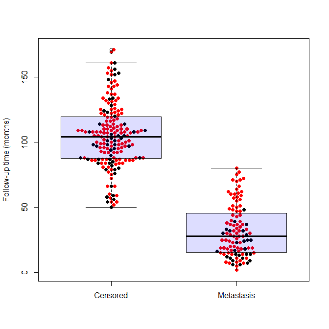
(The image above is called a “Beeswarm Boxplot” , the code for producing this image is provided at the end of this post)
The above plot is implemented under different names in different softwares. This “Scatter Dot Beeswarm Box Violin – plot” (in the lack of an agreed upon term) is a one-dimensional scatter plot which is like “stripchart”, but with closely-packed, non-overlapping points; the positions of the points are corresponding to the frequency in a similar way as the violin-plot. The plot can be superimposed with a boxplot to give a very rich description of the underlaying distribution.
This plot has been implemented in various statistical packages, in this post I will list the few I came by so far. And if you know of an implementation I’ve missed please tell me about it in the comments.
Continue reading “Beeswarm Boxplot (and plotting it with R)”