This is a guest article by Nina Zumel and John Mount, authors of the new book Practical Data Science with R. For readers of this blog, there is a 50% discount off the “Practical Data Science with R” book, simply by using the code pdswrblo when reaching checkout (until the 30th this month). Here is the post:
Normalizing data by mean and standard deviation is most meaningful when the data distribution is roughly symmetric. In this article, based on chapter 4 of Practical Data Science with R, the authors show you a transformation that can make some distributions more symmetric.
The need for data transformation can depend on the modeling method that you plan to use. For linear and logistic regression, for example, you ideally want to make sure that the relationship between input variables and output variables is approximately linear, that the input variables are approximately normal in distribution, and that the output variable is constant variance (that is, the variance of the output variable is independent of the input variables). You may need to transform some of your input variables to better meet these assumptions.
In this article, we will look at some log transformations and when to use them.
Monetary amounts—incomes, customer value, account or purchase sizes—are some of the most commonly encountered sources of skewed distributions in data science applications. In fact, as we discuss in Appendix B: Important Statistical Concepts, monetary amounts are often lognormally distributed—that is, the log of the data is normally distributed. This leads us to the idea that taking the log of the data can restore symmetry to it. We demonstrate this in figure 1.
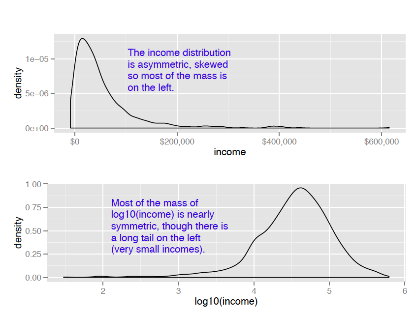
For the purposes of modeling, which logarithm you use—natural logarithm, log base 10 or log base 2—is generally not critical. In regression, for example, the choice of logarithm affects the magnitude of the coefficient that corresponds to the logged variable, but it doesn’t affect the value of the outcome. I like to use log base 10 for monetary amounts, because orders of ten seem natural for money: $100, $1000, $10,000, and so on. The transformed data is easy to read.
An aside on graphing
The difference between using the ggplot layer scale_x_log10 on a densityplot of income and plotting a densityplot of log10(income) is primarily axis labeling. Using scale_x_log10 will label the x-axis in dollars amounts, rather than in logs.
It’s also generally a good idea to log transform data with values that range over several orders of magnitude. First, because modeling techniques often have a difficult time with very wide data ranges, and second, because such data often comes from multiplicative processes, so log units are in some sense more natural.
For example, when you are studying weight loss, the natural unit is often pounds or kilograms. If I weigh 150 pounds, and my friend weighs 200, we are both equally active, and we both go on the exact same restricted-calorie diet, then we will probably both lose about the same number of pounds—in other words, how much weight we lose doesn’t (to first order) depend on how much we weighed in the first place, only on calorie intake. This is an additive process.
On the other hand, if management gives everyone in the department a raise, it probably isn’t by giving everyone $5000 extra. Instead, everyone gets a 2 percent raise: how much extra money ends up in my paycheck depends on my initial salary. This is a multiplicative process, and the natural unit of measurement is percentage, not absolute dollars. Other examples of multiplicative processes: a change to an online retail site increases conversion (purchases) for each item by 2 percent (not by exactly two purchases); a change to a restaurant menu increases patronage every night by 5 percent (not by exactly five customers every night). When the process is multiplicative, log-transforming the process data can make modeling easier.
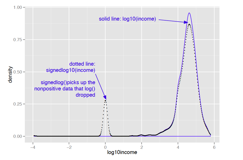
Of course, taking the logarithm only works if the data is non-negative. There are other transforms, such as arcsinh, that you can use to decrease data range if you have zero or negative values. I don’t like to use arcsinh, because I don’t find the values of the transformed data to be meaningful. In applications where the skewed data is monetary (like account balances or customer value), I instead use what I call a “signed logarithm”. A signed logarithm takes the logarithm of the absolute value of the variable and multiplies by the appropriate sign. Values with absolute value less than one are mapped to zero. The difference between log and signed log are shown in figure 2.
Here’s how to calculate signed log base 10, in R:
signedlog10 = function(x) {
ifelse(abs(x) <= 1, 0, sign(x)*log10(abs(x)))
}
Clearly this isn’t useful if values below unit magnitude are important. But with many monetary variables (in US currency), values less than a dollar aren’t much different from zero (or one), for all practical purposes. So, for example, mapping account balances that are less than a dollar to $1 (the equivalent every account always having a minimum balance of one dollar) is probably okay.
Once you’ve got the data suitably cleaned and transformed, you are almost ready to start the modeling stage.
Summary
At some point, you will have data that is as good quality as you can make it. You've fixed problems with missing data, and performed any needed transformations. You are ready to go on the modeling stage. Remember, though, that data science is an iterative process. You may discover during the modeling process that you have to do additional data cleaning or transformation.
For source code, sample chapters, the Online Author Forum, and other resources, go to
http://www.manning.com/zumel/
