2016-05-28 update: I strongly recommend reading the comment by Leland Wilkinson. In summary, “beeswarm” plots are not recommended as they often create visual artifacts that distracts from the estimated density of the observations.
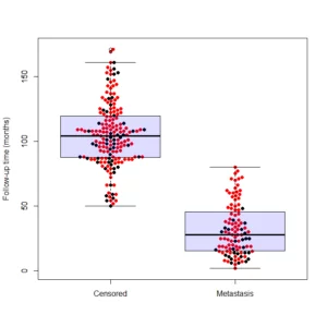
(The image above is called a “Beeswarm Boxplot” , the code for producing this image is provided at the end of this post)
The above plot is implemented under different names in different softwares. This “Scatter Dot Beeswarm Box Violin – plot” (in the lack of an agreed upon term) is a one-dimensional scatter plot which is like “stripchart”, but with closely-packed, non-overlapping points; the positions of the points are corresponding to the frequency in a similar way as the violin-plot. The plot can be superimposed with a boxplot to give a very rich description of the underlaying distribution.
This plot has been implemented in various statistical packages, in this post I will list the few I came by so far. And if you know of an implementation I’ve missed please tell me about it in the comments.
Implementations in commercial statistical packages
GraphPad implements this graph under the name “column scatter plot” (with line drawn at the mean) made from the “Frequency distribution” sample data. So does OriginLab
(My thanks goes to nico for finding this examples)
I imagine there is also something similar in the “big” packages (SAS, JMP, SPSS etc…), but I could not yet find an example.
Implementations in Free Open-Source statistical packages
I’ve noticed that GGobi has a “texture” 1D plot, which is a very similar implementation of this plot. But the main focus of this post will (expectedly) be R.
In the R web-ecosystem, several people have written and asked about this.
In his blog “SAS and R“, Ken Kleinman has wrote about the creation of a dot-box-plot about half a year ago.
He wrapped his code and it can be run using the following command:
source("http://www.math.smith.edu/sasr/examples/wild-helper.R") # getting the boxplonts3 function
ds = read.csv("http://www.math.smith.edu/r/data/help.csv") # getting some data
female = subset(ds, female==1)
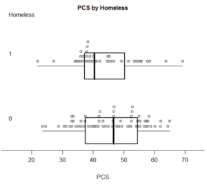
with(female,boxpoints2(pcs, homeless, "PCS", "Homeless"))  # plotting...
With the following pleasing output:
In a followup post, Ken posted of some suggestions he received from his readers on how to make the plot better (through other functions, and also on ggplot2 implementations)
In the R help mailing list, there was recently a question asked on this topic (which had led me to writing this post) asking for:
A band of dots on the plot are the data point. The density of dots and the “fatness” of the band present the frequency of a particular value in Y-axis. This property is similar to the violin plot: showing the probability density of the data at different values. Instead of showing a shape in violin plot, this plot shows the actual distribution of the data points.
Joshua Wiley had responded by pointing some R code he had worked on, based on an algorithm from Leland Wilkinson. However, it is not yet release ready and does not
handle multiple groups (though that is on his todo list).

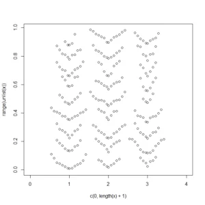
Jim Lemon (the author of the wonderful plotrix R package) have also offered his solution to the problem:
x<-list(runif(90),runif(100),runif(80))

dendroPlot<-function(x,breaks=NA,nudge=NA) {
 if(is.na(breaks[1]))
 breaks=seq(min(unlist(x),na.rm=TRUE),
 max(unlist(x),na.rm=TRUE),length.out=10)
 plot(c(0,length(x)+1),range(unlist(x)),type="n")
 if(is.na(nudge)) nudge<-strwidth("o")/2
 for(list_element in 1:length(x)) {
 binvar<-cut(x[[list_element]],breaks=breaks)
 for(bin in 1:length(levels(binvar))) {
  thisbin<-which(as.numeric(binvar)==bin)
  offset<-(1:length(x[[list_element]][thisbin])-1)*nudge
  offset[seq(2,length(offset),by=2)]<-
   -offset[seq(2,length(offset),by=2)]
  points(list_element+offset,sort(x[[list_element]][thisbin]))
 }
 }
}

dendroPlot(x)
In asking about this plot (almost half a year ago) on CrossValidated, I’ve been offered two wonderful answers.
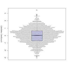
The first one was by Joris Meys who wrote the following Make.Funny.Plot function (I ran it with rnorm(1000) and added an overlay of a boxplot)
Make.Funny.Plot <- function(x){
    unique.vals <- length(unique(x))
    N <- length(x)
    N.val <- min(N/20,unique.vals)

    if(unique.vals>N.val){
      x <- ave(x,cut(x,N.val),FUN=min)
      x <- signif(x,4)
    }
    # construct the outline of the plot
    outline <- as.vector(table(x))
    outline <- outline/max(outline)

    # determine some correction to make the V shape,
    # based on the range
    y.corr <- diff(range(x))*0.05

    # Get the unique values
    yval <- sort(unique(x))

    plot(c(-1,1),c(min(yval),max(yval)),
        type="n",xaxt="n",xlab="")

    for(i in 1:length(yval)){
        n <- sum(x==yval[i])
        x.plot <- seq(-outline[i],outline[i],length=n)
        y.plot <- yval[i]+abs(x.plot)*y.corr
        points(x.plot,y.plot,pch=19,cex=0.5)
    }
}

x <- rnorm(1000)
Make.Funny.Plot(x)
boxplot(x, add = T, at = 0,  col="#0000ff22")  # my thanks goes to Greg Snow for the tip on the transparency colour (from 2007): https://stat.ethz.ch/pipermail/r-help/2007-October/142934.html
And here is the output:
Finally, I saved the best (IMHO) implementation to the last, which is the beeswarm package, it was written by Aron Charles Eklund and shows to be the most promising solution I came by so far. From the help page:
A bee swarm plot is a one-dimensional scatter plot similar to “stripchart”, except that would-be overlapping points are separated such that each is visible.
This function seems to offer the most options for customization such as several methods for placing the points and controlling the characters and colors. This function is intended to be mostly compatible with calls to stripchart or boxplot. Thus, code that works with these functions should work with beeswarm with minimal modification.
Here is an example for using the beeswarm function (many thanks goes to Shane for writing about this solution!)
if(!require(beeswarm)) install.packages(beeswarm)
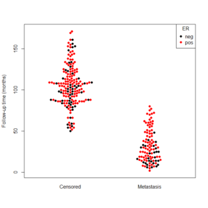
data(breast)
beeswarm(time_survival ~ event_survival, data = breast,
    method = 'swarm',
    pch = 16, pwcol = as.numeric(ER),
    xlab = '', ylab = 'Follow-up time (months)',
    labels = c('Censored', 'Metastasis'))
  legend('topright', legend = levels(breast$ER),
    title = 'ER', pch = 16, col = 1:2)
And the output is the following:
In order to get the plot I presented in the beginning of the post, you’ll need to use a boxplot function after running the beeswarm:
if(!require(beeswarm)) install.packages(beeswarm)
data(breast)

beeswarm(time_survival ~ event_survival, data = breast,
method = 'swarm',
pch = 16, pwcol = as.numeric(ER),
xlab = '', ylab = 'Follow-up time (months)',
labels = c('Censored', 'Metastasis'))

boxplot(time_survival ~ event_survival, data = breast, add = T, names = c("",""), col="#0000ff22")
# my thanks goes to Greg Snow for the tip on the transparency colour (from 2007): https://stat.ethz.ch/pipermail/r-help/2007-October/142934.html
I hope you found this post useful, if you know of more ways to make such a plot – please let me (and others) know about it in the comments.
In the Open Source world, I can add that KNIME’s scatterplot works like that by default (like the stacked dots, to be accurate). It’s actually a shame that this seems so hard to do in R. If only the jitter() function had an option of dot density proportionality, all would be resolved…
Cheers
Marc
If I need to create a boxplot for columns x and y from data file, how should I write down the command?
boxplot(x~y)
or
boxplot(x,y) ?
Hi Greg,
It depends on which function you will use. With the beeswarm function, it will act exactly like boxplot does, so both ways will work.
Is there a way to suppress the xlabels for the boxplot after running the beeswarm plot?
Hi Isaac,
Thank you for the question (or actually, a bug report).
You’d need to use:
names = “”
in the boxplot, so to make sure the boxplot labels don’t clatter the image.
If you wish for no errors to occur, you’d need to have as many “” as the levels of the factor in the X axis. So in our example I used c(“”,””)
I’ve just add the corrected figure to the post. Again, thanks for asking.
Cheers,
Tal
This post is kinda old, but for those intending to use this code, the “method” of the beeswarm should be one of the following: “swarm”, “center”, “hex”, “square”
In the above code it is “smile”, so it won’t work, you have to put “swarm” and then you’ll get the effect of the graph in the beginning of the post.
Hi Halian,
Thank you for the visit and the helpful comment. I just updated my post (I am sure this code had worked when I ran it, I guess the function was updated since).
Cheers,
Tal
Hi Tal, I’ve just implemented dot plots for ggplot2. It’s still a work in progress, but here’s how it works so far:
https://github.com/wch/ggplot2/wiki/geom_dotplot
There are some instructions for testing it out here:
http://groups.google.com/group/ggplot2/browse_thread/thread/51332e42e3b7a70d
Nice graphics and nice post. I just have a short comment on the transparency (see last code snippet). You can also use something like
col = rgb(red = 0, green = 0, blue = 1, alpha = 0.133)
or
col = rgb(red = 0, green = 0, blue = 255, alpha = 34, maxColorValue = 255)
to specify colors with transparency. This is (IMHO) more readable and understandable to most users.
There seems to be a bug in the “at” option… it doesn’t seem to do anything. I used to following command:
> beeswarm(time_survival ~ event_survival, data = breast,+ method = ‘smile’,+ pch = 16, pwcol = as.numeric(ER),+ xlab = ”, ylab = ‘Follow-up time (months)’,+ labels = c(‘Censored’, ‘Metastasis’), at=c(0.5, 1.5))
But it didn’t change the appearance of the plot at all. This is annoying because it means I can’t do subgroups on the plot.
Also it seems that the formula parser is broken; it will do x ~ y but doesn’t seem to handle x ~ y*z; it ignores everything after the y.
Of course I might not have the current version, but I just installed it today. I don’t know how to check what version of beeswarm is installed here, or else I would post that too.
Thanks!
It’s now possible to do this with ggplot2 via this package:
https://github.com/eclarke/ggbeeswarm
People interested in these plots need to read my paper
http://moderngraphics11.pbworks.com/f/wilkinson_1999.DotPlots.pdf
before programming dot plots. Some of the implementations above are useful. One, however, is misleading and should be avoided. That’s the “beeswarm” plot (why did we need a new name for this 100 year old plot?). In the vertical version of the “beeswarm” plot, the Y values are placed at their proper locations but the X values are arbitrarily ordered by the Y values. This creates a visual artifact of U-shaped dot stacks that misrepresent the structure of the data. There are also other examples in the “beeswarm” R program that allow the dots to be asymmetric around a vertical center line. This, too, induces a visual artifact. Dot plots need to be a faithful representation of a density (this is a well-defined statistical concept) and need to converge to a population density as sample size increases.
The main point of my paper was not to devise an algorithm for producing dot plots, but to show that an admissible dot plot algorithm (there are several) needs to be evaluated on its Integrated Mean Square Error (IMSE). I also showed that when this is properly defined, the dot plot loss function resembles the ones used for histograms and kernel density estimates.
As I tried to explain in The Grammar of Graphics, valid visualizations need to pay attention to the underlying mathematical and statistical models on which they are based. It is not enough to draw unstructured pictures of “data,” pretty as they may be.
Thank you for the informative comment Leland. I wrote this post in 2011, and looking back at it I fully agree with your point. It does appear that “beeswarm plots” can easily create a misleading visual artifacts. I updated the post to mention your comment and warn the users from its use.
If you have a recommendation for a specific implementation, please let us know about it in the comments.
Also, thank you for your work on “The Grammer of Graphics” – you’ve made our lives better with it!
With regards,
Tal